Business Card Basics: Templates, Sizing, Design, and Printing

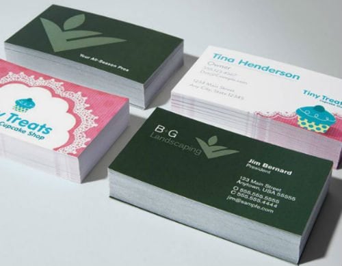
Making a great first impression is essential when you’re a small business owner, and one of the quickest ways to do that is with a professional-looking business card. This wallet-sized tool is essential when it comes to marketing your company, reinforcing your personality, and establishing your brand. A professional, visually appealing, and memorable business card can make you stand out from your competition.
A business card is like a blank canvas; the design possibilities are endless. It all comes down to what kind of lasting impression you want to leave with your new contacts. Use the fonts, colours, size, materials, die cuts and design that will best deliver that message and be relevant to your audience.
Here are a few tips for creating the best business card for your business.
1. Use a business card template
Using a basic template as a starting point for your business card layout will cut down the time it would take you to design your own card from scratch. Pick a template that best captures the professional identity you’d like to project. The UPS Store’s online printing tool offers a wide range of options to help you make your own business cards. Choose from our pre-created templates or create your own using your company logo, photography or graphics by uploading an image. Print your business cards online today. Also, graphic design services are available in-house at The UPS Store.
2. Consider the size
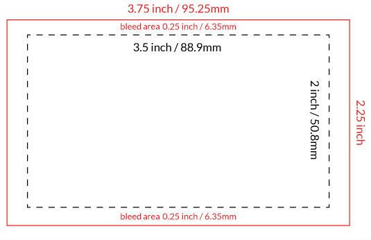
The standard size of a business card in Canada is 88.9mm x 50.8mm (3.5in x 2in). By following these dimensions, your business card will easily fit into a customer’s wallet or holder. However, some of the most striking business cards stray beyond these restrictions, so if you’d like to inject more personality into your cards, feel free to experiment with different shapes, rounded edges, etc.
If you’re designing your own template, be sure to add a “bleed” of 6.35mm (0.25in) around the borders to ensure that the business card content won’t get cut off during the printing process. (A bleed is what goes beyond the edge of the sheet before trimming).
3. Include relevant information
The content of your business card is incredibly important. Be sure to include key information about who are you, what you do, and how people can contact you. In this digital age, it’s also a good idea to include a social media site or two that you are active on daily.
However, when it comes to business cards, more is not always better. A business card is not a brochure. Stay away from adding offers or overloading it with graphics. Remember, good business cards make good promos, but good promos don’t make good business cards.
4. Experiment with business card designs, fonts and colours
A well-designed business card helps you make a good first impression. It represents you or your business, so make it unique and customized. Keep the business card design clutter-free to avoid overwhelming the person reading it, and make sure all of your information is legible.
Pick fonts that best compliment your brand identity. Try to limit the fonts to 2 or 3 to avoid compromising legibility and design. As for the font size, it all depends on the font you choose and on the hierarchy of the information on the card. Some fonts aren’t as legible as others in small sizes. In general, try a 10-12 point font for your name and title, and a 7-8 point font for your contact info.
Besides font size, colours are also important when it comes to legibility. Consider a font colour that stands out when contrasting with the background. To see which colours work well together, check out this contrast table.
Try to use the pantone book to pick your colours and use the same pantone colour codes you used in your card design file. It’s the best way to ensure that the printed colours are going to show up correctly.
Plan your design on the medium you’re going to print on. Some colours show up differently on different materials.
Some people like to write notes on business cards. Considering leaving some space and make sure the material you use allows people to write on it.
5. Get creative
You can get creative with business card materials (paper, plastic, rubber, magnetic, etc.), embellishments (emboss, deboss, spot uv, foil tamping, letterpress, etc.) and shapes (die cuts, rounded corners, fold-overs, etc.)
It is important to print your business card on high-quality stock and to use good quality ink in order to ensure you are presenting yourself in the most professional manner. Bring your ideas to The UPS Store and we can help you create custom business cards in full colour, with glossy or matte paper stock, single-sided or double-sided.
6. Solicit opinions
Put your business card design to the test. Ask someone to take a quick look at it. In five seconds, that person should get a good idea about you or your business and know how to reach you or learn more about what you do.
You have one chance at a first impression; make it count by picking the material and design that best reflect that impression. The UPS Store can help you design the business card that best represents you and your business
